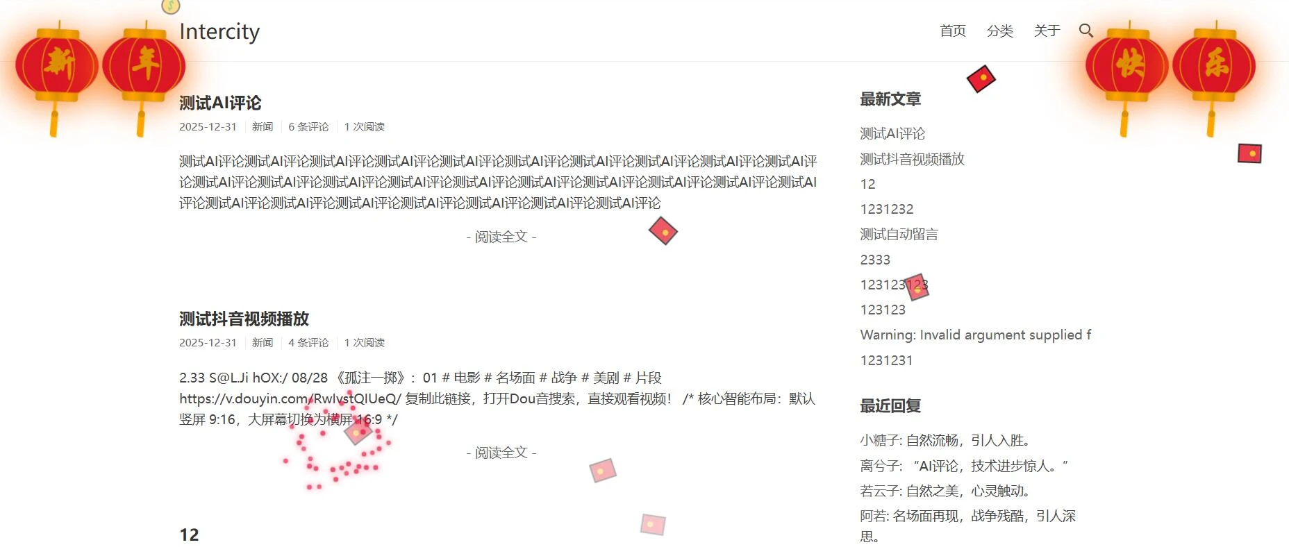
明天2026年了,给你的博客增加一些喜庆的灯笼
测试环境:typecho
代码放置:footer.php,</body>前
<div id="new-year-pro-max" style="position: fixed; top: 0; left: 0; width: 100%; height: 100%; pointer-events: none; z-index: 999999; overflow: hidden;">

    <div class="deng-container left-1"><div class="deng-box"><div class="deng"><div class="xian"></div><div class="deng-a"><div class="deng-b"><div class="deng-t">新</div></div></div><div class="shui shui-a"><div class="shui-c"></div><div class="shui-b"></div></div></div></div></div>
    <div class="deng-container left-2"><div class="deng-box"><div class="deng"><div class="xian"></div><div class="deng-a"><div class="deng-b"><div class="deng-t">年</div></div></div><div class="shui shui-a"><div class="shui-c"></div><div class="shui-b"></div></div></div></div></div>

    <div class="deng-container right-2"><div class="deng-box"><div class="deng"><div class="xian"></div><div class="deng-a"><div class="deng-b"><div class="deng-t">快</div></div></div><div class="shui shui-a"><div class="shui-c"></div><div class="shui-b"></div></div></div></div></div>
    <div class="deng-container right-1"><div class="deng-box"><div class="deng"><div class="xian"></div><div class="deng-a"><div class="deng-b"><div class="deng-t">乐</div></div></div><div class="shui shui-a"><div class="shui-c"></div><div class="shui-b"></div></div></div></div></div>

</div>

<style>
/* === 灯笼位置调整 === */
.deng-container { position: fixed; top: -20px; z-index: 9999; pointer-events: none; transform: scale(0.8); } /* 稍微缩小一点以容纳四个 */
.deng-container.left-1 { left: -20px; }
.deng-container.left-2 { left: 80px; }
.deng-container.right-2 { right: 80px; }
.deng-container.right-1 { right: -20px; }

/* === 经典灯笼样式 === */
.deng-box { position: relative; }
.deng {
    position: relative; width: 120px; height: 90px; margin: 50px;
    background: rgba(216, 0, 15, 0.9); border-radius: 50% 50%;
    transform-origin: 50% -100px; animation: swing 3s infinite ease-in-out;
    box-shadow: -5px 5px 50px 4px rgba(250, 108, 0, 1);
}
.deng-a { width: 100px; height: 90px; background: rgba(216, 0, 15, 0.1); margin: 12px 8px 8px 10px; border-radius: 50% 50%; border: 2px solid #dc8f03; }
.deng-b { width: 45px; height: 90px; background: rgba(216, 0, 15, 0.1); margin: -2px 8px 8px 26px; border-radius: 50% 50%; border: 2px solid #dc8f03; }
.xian { position: absolute; top: -20px; left: 60px; width: 2px; height: 20px; background: #dc8f03; }
.shui-a { position: relative; width: 5px; height: 20px; margin: -5px 0 0 59px; animation: swing 4s infinite ease-in-out; transform-origin: 50% -45px; background: #ffa500; border-radius: 0 0 5px 5px; }
.shui-b { position: absolute; top: 14px; left: -2px; width: 10px; height: 10px; background: #dc8f03; border-radius: 50%; }
.shui-c { position: absolute; top: 18px; left: -2px; width: 10px; height: 35px; background: #ffa500; border-radius: 0 0 0 5px; }
.deng:before { position: absolute; top: -7px; left: 29px; height: 12px; width: 60px; content: " "; display: block; z-index: 999; border-radius: 5px 5px 0 0; border: solid 1px #dc8f03; background: linear-gradient(to right, #dc8f03, #ffa500, #dc8f03, #ffa500, #dc8f03); }
.deng:after { position: absolute; bottom: -7px; left: 10px; height: 12px; width: 60px; content: " "; display: block; margin-left: 20px; border-radius: 0 0 5px 5px; border: solid 1px #dc8f03; background: linear-gradient(to right, #dc8f03, #ffa500, #dc8f03, #ffa500, #dc8f03); }
.deng-t { font-family: "华文行楷", "KaiTi", serif; font-size: 3.2rem; color: #dc8f03; font-weight: bold; line-height: 85px; text-align: center; }

@keyframes swing { 0%, 100% { transform: rotate(-10deg) } 50% { transform: rotate(10deg) } }

/* === 烟花与粒子样式 === */
.fw-rocket { position: absolute; width: 3px; height: 20px; background: linear-gradient(to top, transparent, #ffd700); opacity: 0; }
.fw-particle { position: absolute; width: 6px; height: 6px; border-radius: 50%; opacity: 0; box-shadow: 0 0 10px var(--c), 0 0 2px #000; background-color: var(--c); }
.ny-item { position: absolute; will-change: transform; font-size: 24px; animation: ny-fall linear forwards; }
@keyframes ny-fall { 0% { transform: translateY(-50px) rotate(0deg); opacity: 0; } 10% { opacity: 1; } 100% { transform: translateY(105vh) rotate(360deg); opacity: 0; } }

/* 移动端自动隐藏,防止遮挡手机屏幕 */
@media (max-width: 768px) {
    .deng-container.left-2, .deng-container.right-2 { display: none; }
}
</style>

<script>
(function() {
    const container = document.getElementById('new-year-pro-max');

    // 解决“一坨”问题的升空逻辑
    function launchFirework(side) {
        const xPos = (Math.random() * 25 + (side === 'left' ? 10 : 65)) + 'vw';
        const targetY = (Math.random() * 25 + 20) + 'vh';
        const rocket = document.createElement('div');
        rocket.className = 'fw-rocket';
        rocket.style.left = xPos; rocket.style.bottom = '0';
        container.appendChild(rocket);

        rocket.animate([
            { transform: 'translateY(0)', opacity: 1 },
            { transform: `translateY(-${100 - parseFloat(targetY)}vh)`, opacity: 0 }
        ], { duration: 800, easing: 'ease-in' }).onfinish = () => {
            rocket.remove();
            explode(xPos, targetY);
        };
    }

    function explode(x, y) {
        const colors = ['#ff0033', '#ffd700', '#00ffcc', '#ff00ff', '#ff6600'];
        const color = colors[Math.floor(Math.random()*colors.length)];
        for(let i=0; i<40; i++) {
            const p = document.createElement('div');
            p.className = 'fw-particle';
            p.style.setProperty('--c', color);
            p.style.left = x; p.style.bottom = y;
            const angle = (Math.PI * 2 / 40) * i;
            const velocity = Math.random() * 120 + 80;
            const tx = Math.cos(angle) * velocity + 'px';
            const ty = Math.sin(angle) * velocity + 'px';
            container.appendChild(p);
            p.animate([
                { transform: 'translate(0, 0) scale(1)', opacity: 1 },
                { transform: `translate(${tx}, ${ty}) scale(0.3)`, opacity: 0 }
            ], { duration: 1200 + Math.random() * 600, easing: 'ease-out' }).onfinish = () => p.remove();
        }
    }

    // 自动飘落 Emoji
    const items = ['🧧', '💰'];
    setInterval(() => {
        const item = document.createElement('div');
        item.className = 'ny-item';
        item.innerHTML = items[Math.floor(Math.random()*items.length)];
        item.style.left = Math.random() * 95 + 'vw';
        item.style.animationDuration = (Math.random() * 5 + 10) + 's';
        container.appendChild(item);
        setTimeout(() => item.remove(), 15000);
    }, 1500);

    // 烟花发射
    setInterval(() => launchFirework('left'), 4000);
    setTimeout(() => setInterval(() => launchFirework('right'), 4000), 2000);
})();
</script>